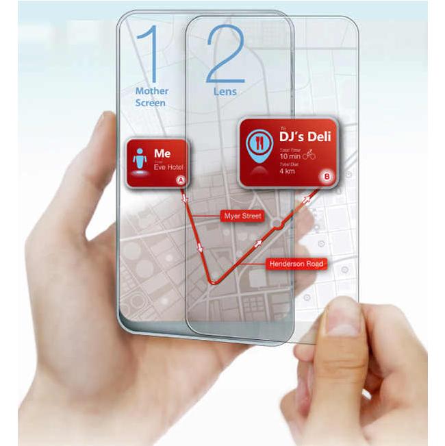
Take your average touch screen, multiply it, then combine both
screens into one phone. The designers didn’t bother with the engineering
part, however, so their concept has to be taken on blind faith that
it’s awesome. According to the available concept illustrations, each
touchscreen are independent wireless devices that can be separated or
opened like a book. Wenhing Chou and Kok Keong Wong might be onto
something.

Blessed with so-called twin-splitting transparent displays, the Space
3 phone (or Spaceeee–get it?) has no specifications or features worth
mentioning. It’s a concept, remember?
This is the reason why design remains an appealing career. Designers
aren’t often put to task for their creation’s lack of engineering. The
results are sometimes startling, sometimes ludicrous to a hilarious
degree. (No names though.)
To bother trying to make the Space 3 phone more tangible, imagine if
the R&D for producing such a gadget went full throttle and what came
out was a highly modular handheld PC with phone features plus a few
extras. Think video game console, ultimate hacking device, credit card,
and ebook reader. That’s the genius behind concepts, they can be
everything at once.
Here’s to hoping a few of the ideas inspird by the Space 3 do see the light of day.
Source Yanko Design |